
The Do’s and Don’ts of Form Creation: Best Practices to Follow
Forms. They’re everywhere.
They help us sign up for newsletters, book appointments, and even find out our dog’s personality based on his favourite chew toy.
But let’s face it, filling out a form can sometimes feel like pulling teeth.
So, how do you make forms that people don’t immediately close out in frustration?
Stick around, and I’ll tell you exactly how.
Importance of Forms in Online Interactions
Forms are the bridge between you and your audience.
Whether you’re collecting email addresses for marketing or gathering feedback, forms are essential.
But a poorly designed form? It’s a disaster.
Think high bounce rates, low completion rates, and users leaving in a huff.
This post is your guide to avoid that mess.
Ready to dive in?
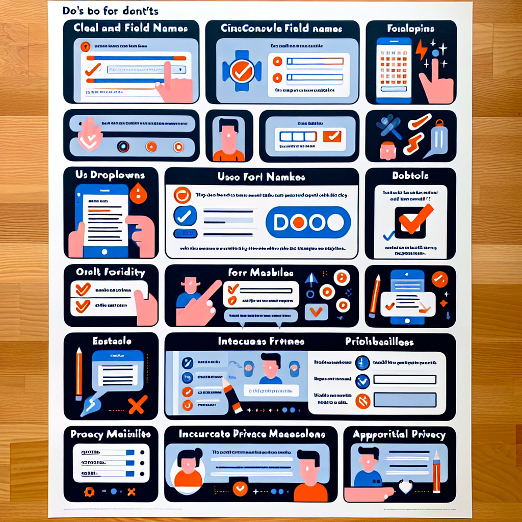
Do’s of Form Creation
1. Do Keep It Simple
Don’t complicate things.
Limit the number of fields.
People hate fields.
If you can get away with just asking for a name and email, do it.
Use clear and concise labels.
Anyone should be able to glance at your form and understand what you need.
"First Name," not "Given Name."
2. Do Use Logical Flow
Organise questions in a natural order.
Don’t start by asking for a phone number before you ask for a name.
Group related questions together.
Name and email in one section, payment details in another.
3. Do Make It Mobile-Friendly
Most people fill out forms on their phones.
Ensure your forms are responsive.
They should look slick on a laptop and just as slick on a smartphone.
Test on different devices.
iPhone, Android, tablets—don’t leave any stone unturned.
4. Do Include Helpful Instructions
People get stuck.
Provide tooltips or examples.
"Enter your email (e.g., name@example.com)" is much better than just "Email."
Use error messages that guide users.
"Please enter a valid email address" beats "Error" any day.
Don’ts of Form Creation
1. Don’t Overwhelm Users
Too many questions at once?
Big no-no.
Break it up.
If you need more info, consider multi-step forms.
Don’t ask for unnecessary information.
Do you really need someone’s home address to send them a welcome email?
Probably not.
2. Don’t Use Jargon or Complex Language
Keep your language simple and accessible.
If your gran wouldn’t understand it, don’t use it.
Avoid technical terms unless absolutely necessary.
If you must use them, explain them.
3. Don’t Forget About Accessibility
Ensure compatibility with screen readers.
Your forms should be usable for everyone.
Use high contrast and legible fonts.
Don’t go fancy on the fonts.
Clarity over creativity any day.
4. Don’t Neglect Testing
Always test your forms before launch.
A test drive catches issues that could otherwise sink you.
Gather feedback and iterate on the design.
If users say they’re confused by a question, fix it.
Conclusion
To recap:
- Keep it simple: Fewer fields, clear labels.
- Logical flow: Group related questions, natural order.
- Mobile-friendly: Test on all devices.
- Helpful instructions: Tooltips, clear error messages.
- Don’t overwhelm: Avoid unnecessary questions.
- Simple language: No jargon.
- Accessible: Screen reader compatibility, high contrast fonts.
- Test and iterate: Always strive to improve.
Following these best practices makes form-filling a breeze.
It’s worth it for happier users and better completion rates.
Need an easy way to create forms?
Give MakeForm a try.
It’s user-friendly and takes the hassle out of form design.
FAQs
Q: What’s the ideal number of fields for a form?
A: Aim for as few as possible. Ideally, keep it under five if you can.
Q: How can I ensure my form is accessible?
A: Use screen-reader-friendly design, high contrast colours, and legible fonts.
Q: Is it necessary to test on multiple devices?
A: Absolutely. Your form needs to be seamless on laptops, smartphones, and tablets.
By the way, if you’re reworking your online strategy, check out our guide on improving user experience.
Keep it simple, make it user-friendly, and you’ll see the benefits.
Happy form creating!
Any other questions? Fire away in the comments or reach out directly!